Inspirations Magazine Behind the Scenes Part 5 |Design
28TH NOVEMBER 2025 - ASU #504
So far in our special multi-part series explaining how each issue of Inspirations magazine is created, we’ve chosen the projects, written the instructions, crafted the feature articles, and taken the photographs.
This week, we’re putting it all together as we look at what’s involved in the graphic design and layout process.
Part 5 – The Design
Imagine an incredibly complex Tangram or Tetris puzzle where a series of different-shaped pieces all need to fit together in just the right sequence to create a cohesive result.
That is the challenge the Inspirations design team faces each time they start work on a new issue of the magazine. They are, essentially, highly skilled puzzle solvers.
Let us set the scene for you…
All the copy for the feature articles appearing at the front of the magazine is ready, as are all the photographs supplied for these stories.
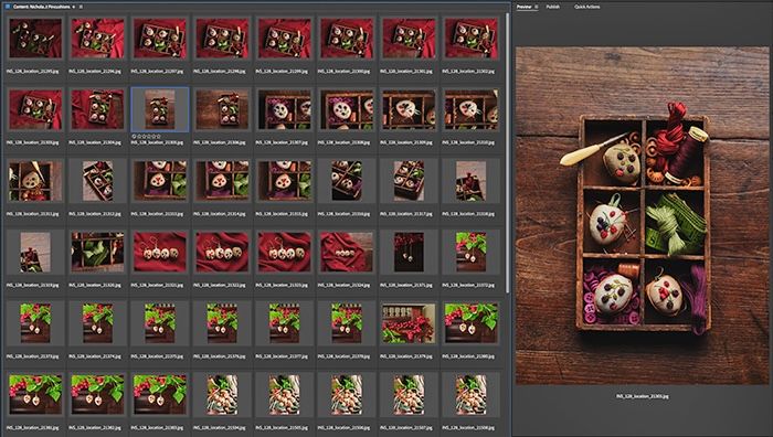
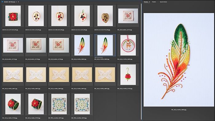
The editorial team has written the instructions for each project, the step-by-step photographs have been taken, and the hand-drawn diagrams are complete. In addition, our photographer has delivered a hard drive containing hundreds of images captured both in the studio and on location.
Oh, and all the advertisements allocated for the magazine are also ready - some at finished artwork stage, others still needing to be designed.
These are the assets handed over to the design team on the very first day of layout.
It’s both an exciting and daunting day for Inspirations Studios Senior Designer Lynton Grandison, who has been working on the magazine since issue #31.
It’s his job to review everything and begin mapping out how it might all come together.
His biggest challenge? Just like our puzzle analogy, the layout of the magazine follows a fixed format. There are parameters he cannot move, and all the pieces must fit neatly within those boundaries.
For example, each issue must adhere to a strict weight limit that, if exceeded, incurs significant postal surcharges. This means Lynton has a fixed number of pages to fit all the content he has been supplied.
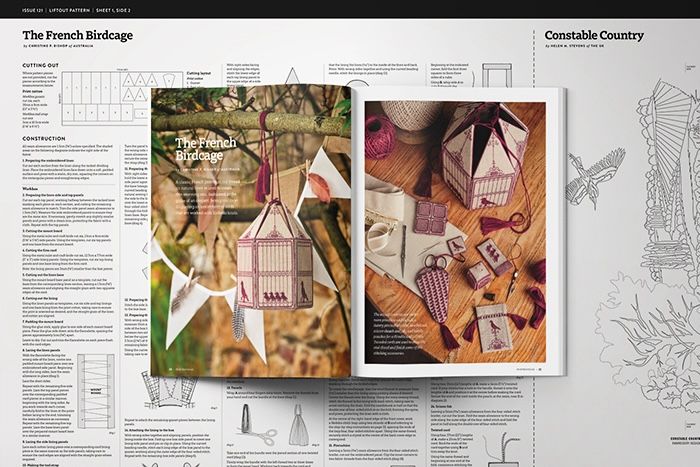
One variable he can play with is the pattern sheet. These are printed on thin ‘Bible paper’ to keep weight to a minimum and usually contain only the designs for transfer purposes. Occasionally, however, he can use the pattern sheet as overflow space for additional construction information.
Other fixed parameters include the mandatory pages that appear in every issue, commitments made to advertisers, and the need to uphold the style guide to ensure the magazine always feels luxurious and rich in presentation.
So how does Lynton and his team make the impossible happen and fit all these puzzle pieces into the frame they’re working within? Lynton explains…
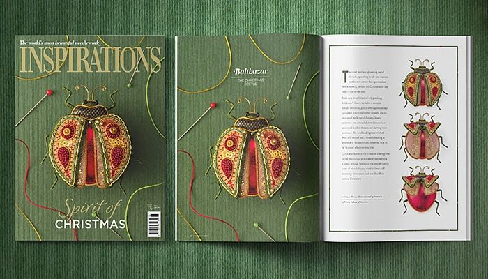
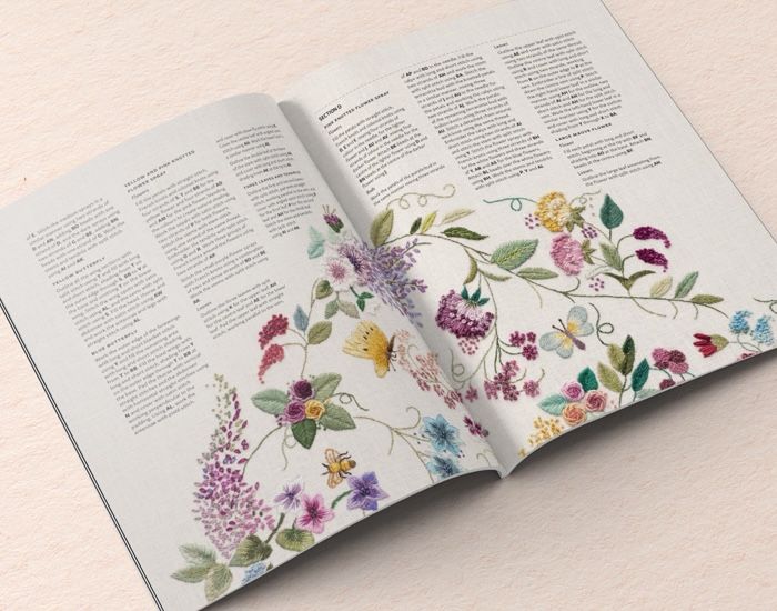
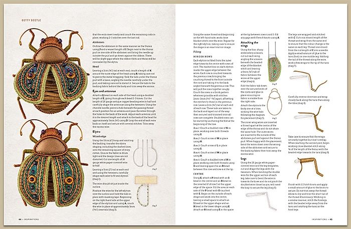
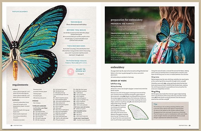
‘First and foremost, my priority is to hero the embroidery. The highest consideration must be given to ensuring that, when someone reads the magazine, the instructional information is presented clearly and is easy to follow.
This is often difficult to achieve, as the projects we publish include very complex and detailed instructions. It’s a process of distillation and finding the perfect balance between the delivery of information and the aesthetics.’
‘If you get that balance wrong, the page can quickly look overwhelming -too busy and uninviting.
_On every page there should be a natural path for your eye to follow, from upper left to bottom right. _
Everything should feel like it flows naturally and is easy for the eye to take in.’
After spending time with Lynton and learning more about how the design team works, what became clear was just how many variables they manage and how they’ve developed highly flexible, nimble processes to deal with them.
If we were to equate this to stitching, there would be an enormous amount of stitching, unpicking, restitching, and more unpicking - layer upon layer of refinement.
It reminded us of taking an embroidery design and trying to make it fit onto a piece of clothing, perhaps the pocket of a shirt. You’re given a collection of motifs and design elements to squeeze into a small area, and it’s not until you start stitching that you realise your scale is off, your placement needs rethinking, or perhaps the colours you’ve chosen don’t pop against the ground fabric.
Lynton and his team do have one major advantage over we stitchers, however: everything they do is digital. So, while their process is still incredibly time-consuming, at least they have the luxury of tools like undo, copy, paste and save as.
Imagine if we had those magic features when we stitch!Imagine if we had those magic features when we stitch!
Once a draft layout for the magazine has been finalised with all the puzzle pieces in place and all parameters adhered to, Lynton and his team move to the next stage: colour-matching all the photographs to the original stitched projects.
This is exactly as it sounds: the designer holds the original piece next to a specially calibrated computer monitor and uses specialised software to tweak each photograph until it aligns with the colours of the actual embroidery.
This level of detail and care is part of what makes Inspirations the world-class publication it is. The technical correctness of every instruction, diagram, step-by-step photo, and even the accuracy of every colour tone in every image ensures that readers have everything they need to recreate each project exactly as it appears in the magazine.
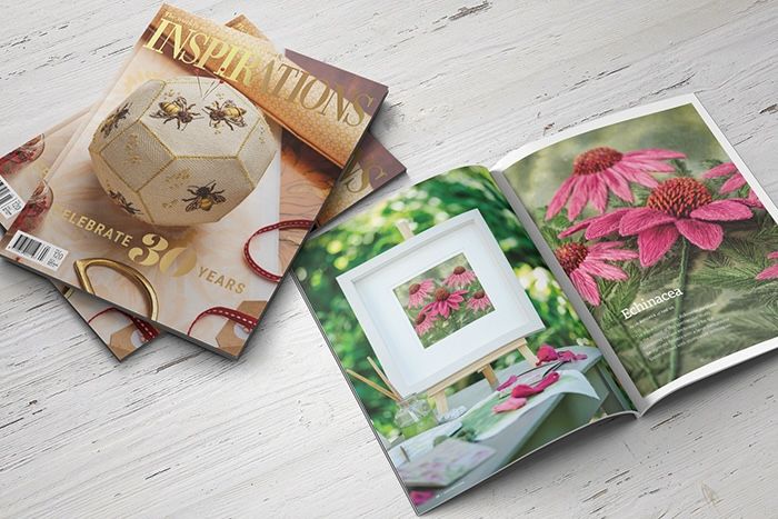
We’ll leave you with a fun fact Lynton shared that even our most ardent readers may not have realised… the magazine has undergone several design updates over the years, with the most recent ones occurring precisely every 20 issues. Many will remember the major update when Inspirations issue 80 was released. It was the first and only time the magazine changed size, growing in both height and width. As Lynton recalls, ‘this gave us a larger canvas to work with, and we used it to showcase embroidery more beautifully than ever before.’
When issue 100 arrived, this celebratory edition featured updated layouts, new fonts, and a refreshed contents page.
Issue 120 introduced further refinements with more modern layouts, refreshed headings, increased negative space for enhanced readability, additional pages for feature projects, more full-page photographs and a redesigned contents page.
We asked Lynton whether he was planning another refresh when issue 140 comes out. With a smile, he said, ‘you’ll have to wait and see!’
We hope you’ve enjoyed our Behind the Scenes series, which is taking a short break for now. Don’t worry, we’ll be back in the new year with more fascinating insights.
Remember, the best way to enjoy each issue of Inspirations is as a subscriber. Not only do you save on postage, receive VIP treatment, and enjoy 15% off Inspirations kits, but your support ensures we can continue producing the world’s most beautiful needlework magazine for many years to come.